|
Refit: Winter 2008-2009
|
Winter 2008-2009 Refit | Wednesday, April 29, 2009 (and
days preceding)
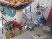
Over the weekend, I carried piles of
general boat gear down from its winter storage area in the
attic and loaded it on the boat. As always, I was
stunned at the sheer quantity of stuff. Good grief. |
 |
Soon, I planned to move
the boat outdoors, to make engine test-running easier and to
prepare for final washdown, mast-loading, and general
preparations for transport and launch. Before that,
however, it was time to get the new graphics for the name
and hailing port completed.
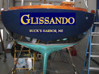
Earlier, during the
winter, I'd done some work online and found several fonts
that I liked, and dabbled around with a photo of the boat's
transom and some Photoshopping to superimpose the various
choices on the "boat". Eventually, we narrowed down to
one final choice. |
 |
Several months went by
while I just couldn't manage to find the time to get to a
local shop to have the new vinyl made up. Eventually,
the pending launch date dictated that I get this done.
Armed with my printed mockups of the boat's transom and the
font I'd chosen (for which I didn't know the name), I
visited
Clark Signs and Graphics, which was about as nearby as
anything, and ordered the new graphics. It took a
couple emailed proofs and minor manipulations to get the
proposed look the way I wanted it, after which the new vinyl
was made up in short order by the friendly folks at Clark's.
Once again, I chose gold leaf vinyl with a white
outline--a classic choice. I chose a different look
than the
original graphics, which over time I had found I liked
less and less, and which I had generally always found to be
too large--my own fault for choosing the size in the first
place. I'd been threatening to make some changes to
the look of the name for years, but it never had happened,
as I kept thinking that "next year" I'd paint the boat, etc.
Plus, for two years I'd had the wrong hailport on the stern.
Well, this year I finally painted the boat, and the time
to change the graphics had arrived. This time I wanted the
name to be better proportioned to the size of the transom.
Additionally, I scaled down the size of the hailing port,
with no intentions (nor possibility) of documenting the boat
and therefore no need to use huge 3" lettering for the port.
Even though I'd spec'd the overall length of the new
name (about 30", which I determined after mocking things up
on the transom), when I picked up the vinyl it seemed tiny
on the table at the graphics shop. I worried briefly
that I'd made a mistake. Fortunately, when I got back
to the boat I could see that it was what I wanted and I
shouldn't have doubted myself.
I spent a few hours
installing the vinyl. I'd simply ordered the vinyl cut
straight, without an arc, but to install on a curved transom
I'd need to do some layout to ensure that the name didn't
form a smile shape, which flat vinyl will do on a curved
surface. |
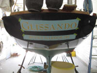 |
So I spent a bit of time
determining an appropriate location for the base of the
letters, and then marked out a baseline on the transom that
followed the slight curve of the deck camber above.
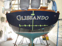
This gave the name a subtle arc when installed. To
make the letters follow the line I'd laid out, I cut the
vinyl mask between the letters as needed before installing.
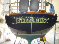
I applied some tape to hold the letters in their general
arc, which was nice for taking a photo to show how
much a flat name needs to be curved to appear more or less
straight (or with a subtle arc) on the transom, but the tape
proved to be an annoyance during installation, as I needed
to manipulate the letters individually, and ended up cutting
the tape as I went.
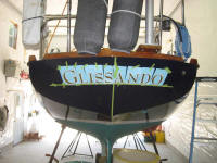
Finally, I installed the name and
squeegeed it out. |

 |
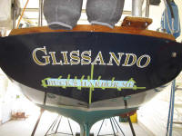
Next, I marked a
similar line further down the transom for the hailport.
This time, however, I marked the baseline so that it was
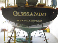
level from side to side. After mocking up and cutting
the mask as needed, I installed the hailport as well. |
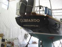 |
I went back and forth for
some time on whether to include an apostrophe in Buck's
Harbor. Observation over time had indicated that it
was common to see it both with and without the punctuation
on other boats' transoms, in cruising guides and other
writings, and in other sundry locations. Complicating
the inconsistency further was the fact that the NOAA chart
for the area indicated that it should be Bucks Harbor,
without the apostrophe. In the end, I chose to use an
apostrophe because all correspondence from the town and
specifically the harbormaster used it--if it's good enough
for the harbormaster, then I decided it would be how I
should spell it.
Such are the important issues
with which I wrestle.
Here is a comparison of my
Photoshop mockup with the actual lettering. I will get
better pictures of the name once the boat is outdoors in
natural light. |

 |
Total time today: 4 hours
Previous |
Next |
|